Starting a website with a template from a website builder is a fantastic, quick way to get online professionally. These pre-designed layouts offer a clear structure and appealing aesthetics, making the initial setup straightforward even without design or coding experience. Many people customize their chosen template with branding and launch their site with confidence.
However, as your website and business grow, you might worry about outgrowing your initial design, fearing a complete rebuild is inevitable. The good news is that modern website builder templates are designed for significant evolution and expansion without needing to start from scratch. Understanding how to leverage these tools ensures your site can adapt and scale alongside your ambitions, keeping your online presence fresh and functional.
Understanding Template Foundations
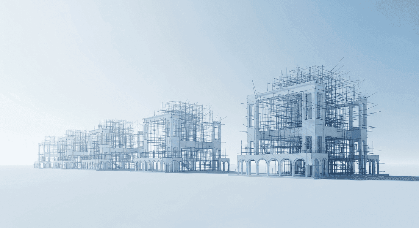
A website builder template is more than just a visual skin; it's a carefully constructed digital framework. It provides a consistent layout, typography, and color palette, forming a professional starting point. Think of it as a sturdy, adaptable blueprint. Its underlying code and design principles are built to be flexible, allowing elements to be rearranged, new sections added, and existing components refined without collapsing the entire structure.
The modularity of these foundations is key to scaling. Most templates utilize blocks or sections that can be individually customized, moved, or duplicated. This means you're not altering a rigid design, but rather working with interconnected parts. Recognizing this empowers you to see your template not as a fixed design, but as a living canvas ready for thoughtful modifications as your website's needs evolve.
Strategic Customization: Beyond Colors and Fonts
Initial template customization typically focuses on visible aspects like images, fonts, and color schemes to establish brand identity. However, true template scaling requires exploring deeper design capabilities. This means refining layouts, adding new content sections, or even modifying element behaviors. You might adjust column widths, introduce new content blocks like testimonials, or integrate advanced components such as accordions to organize information effectively.
The goal here is to enhance functionality and user experience while maintaining a cohesive aesthetic. As your website grows, you'll likely need to present more information or offer new features. Strategically customize your layout to accommodate these changes naturally, perhaps creating new pages with different section arrangements or subtly altering existing ones to feature updated content prominently within your template's flexible structure.
Leveraging Advanced Features for Growth
Modern website builders are equipped with powerful features designed to help your site grow without requiring a complete redesign. These tools provide sophisticated control over your site's appearance and functionality, simplifying widespread changes and complex content management. Mastering them is a cornerstone of effective template scaling.
- Global Styles/Theme Settings: Define fonts, colors, and spacing once, applying them site-wide. Changing a style in one place updates it everywhere, ensuring consistency and saving time.
- Reusable Sections/Blocks: Design a specific section (e.g., a call-to-action or footer) once and reuse it across multiple pages. Edit the master, and changes propagate automatically.
- Conditional Visibility: Show or hide specific elements or sections based on conditions like user login or page type, enabling personalized experiences without custom code.
- Responsive Design Controls: Adjust how elements appear on different screen sizes (desktop, tablet, mobile) for optimal display and function across all devices.
Content Strategy as a Design Tool
Your content strategy is as vital as visual design for template evolution. How you organize, write, and present information profoundly impacts user experience and makes a simple template feel robust. As your business expands, so will your content volume and variety, from new service descriptions to blog articles and product galleries.
Consider how new content integrates with your existing template. Can you use flexible column layouts for product images and detailed descriptions? Will your blog post template adapt well to longer articles with embedded media? Thoughtful content structure—clear headings, concise paragraphs, effective bullet points, and high-quality imagery—can elevate even a basic template, making it appear more sophisticated and capable of handling complex information without a visual overhaul.
Performance and User Experience (UX) Considerations
Scaling isn't solely about adding new features or making aesthetic changes; it's also crucial to maintain or improve your site's performance and overall user experience. A bloated or slow website, regardless of how good its design, will deter visitors. As you add more content, images, and functionalities, it's essential to keep optimization in mind.
Ensure all images are properly compressed and sized for the web to prevent slow loading times. Regularly review your site for any unused plugins or unnecessary elements that might be weighing it down. Pay attention to navigation: as your site grows, your menu structure might need re-evaluation to remain intuitive and easy to use. A well-organized, fast-loading, and responsive website built on a flexible template will impress visitors, boost search engine visibility, and enhance overall user satisfaction.
Knowing When to Consider a New Path
While modern website builder templates offer remarkable flexibility for growth, it's also important to acknowledge that there might come a point where a fundamental shift in your online presence is necessary. This is rarely due to outgrowing the design capabilities of a template itself, but rather a fundamental change in your business model or a need for highly specialized functionality that no template or builder can reasonably provide. For instance, evolving from an informational site to a complex e-commerce platform with intricate inventory management might warrant a different solution.
However, for the vast majority of websites, the scalability built into contemporary templates is more than sufficient. Before considering a complete migration, thoroughly explore all the advanced customization options, integrations, and content management strategies available within your current builder. Often, what appears to be a template limitation is actually an opportunity to learn and leverage a deeper feature set, proving that your initial foundation can indeed support a much larger and more sophisticated online presence than you first imagined.
Sources & Further Reading
- Fast load times — web.dev
- Version control — Wikipedia
- Design Systems 101 — Nielsen Norman Group
- Content Strategy — Interaction Design Foundation
- Web Components — MDN Web Docs